Growth Rate Calculation Guide for GTM Teams in 2026
A founder opens Monday's pipeline review with a confident claim: last year's ARR was small, this year's number is much larger, so growth must be excellent. The room nods until someone checks the time period, the starting base, and whether the CRM definitions stayed consistent. The arithmetic takes less than a minute. The interpretation takes the rest of the meeting.
A useful growth rate calculation answers three separate questions. Does the rate match the cadence of the data? Is the denominator fair? Did the measurement process stay stable? A percentage can be mathematically correct and still support the wrong decision. Operators comparing pipeline, revenue, or audience growth need more than a formula. They need a defensible choice of time window, base, and smoothing method.
For a practical introduction to the broader business context, Jumpstart Partners on business momentum offers a useful reference on comparing growth across periods. The important operating principle is simple: growth rate calculation is a decision about comparability, not just division.
Table of Contents
- Why the Formula Is the Easy Part
- The Two Formulas Every Operator Should Memorize
- Choosing the Right Growth Rate for Each Cadence
- Excel and Google Sheets Templates That Hold Up
- Where Growth Rate Calculations Mislead
- Putting Growth Rate Calculation Into Your Reporting Loop
Why the Formula Is the Easy Part
The basic formula is familiar. Subtract the old value from the new value, then divide by the old value. The problem starts when teams treat that output as a complete explanation.
A weekly pipeline review often mixes several views without naming them. One person reports week over week movement, another cites year over year growth, and a third presents a multi year CAGR. Each number may be valid in isolation. Together, they can create a misleading narrative if the team doesn't agree on the cadence and purpose of each measure.
Three decisions sit behind the arithmetic
The first decision is cadence. Weekly data helps sales leaders manage immediate execution, but it can be irregular because opportunities move in batches. Monthly data gives a cleaner operating pulse, while quarterly data can better reflect longer B2B buying cycles. A multi year board discussion needs a measure that smooths interim movement rather than overreacting to one unusual period.
The second decision is denominator. Percentage change always uses the earlier value as its base. That means the same absolute increase can represent very different growth depending on where the metric started. A small starting base can make a modest business change look dramatic, while a large base can make meaningful expansion look restrained.
The third decision is measurement stability. A CRM stage rename, a new attribution rule, or a change in how net new logos are classified can alter the reported curve without changing the underlying business. Central statistical agencies face the same issue at a larger scale. The Bank of Japan's updated estimation methodology discusses revisions designed to better account for quality improvements, capital utilization, labor market estimation, and mismatches. The lesson for GTM teams is direct: the data generating process deserves an audit.
Practical rule: Before debating whether growth is good, confirm what changed, what stayed comparable, and which period supplies the denominator.
A reliable weekly meeting therefore treats the rate as an input to judgment. The team should state the metric definition, comparison window, starting base, and known data changes before discussing performance. That discipline prevents a clean number from becoming a false conclusion.
The Two Formulas Every Operator Should Memorize
Most GTM reporting can be handled with two formulas. Percentage change describes movement between two periods. Compound annual growth rate, or CAGR, describes the steady annual rate that would connect a starting value to an ending value across multiple periods.
Percentage change for operating periods
The formula is:
(New value minus Old value) divided by Old value
Written compactly:
(EV minus BV) divided by BV
The earlier value must remain the denominator. Investopedia's explanation of growth rates uses the same mechanic and shows why the starting base changes the interpretation. A value that rises from 100 to 120 represents 20 percent growth, while a rise from 1,000 to 1,020 represents 2 percent growth, despite the same absolute increase.
Consider monthly recurring revenue moving from $180,000 to $216,000. The change is $36,000. Dividing that change by $180,000 produces 20 percent month over month growth.
That answer is appropriate for a period to period operating view. It doesn't claim that the business will continue at that pace, and it doesn't smooth out future volatility. It describes what changed between the two selected periods.
CAGR for multi period reviews
CAGR uses a different question:
What constant annual rate would turn the starting value into the ending value across the full period?
The formula is:
(EV divided by BV) raised to the power of 1 divided by n, minus 1
Investopedia's CAGR reference defines the calculation as a smoothing measure across multiple periods. For ARR moving from $2.4 million to $4.8 million across three years, simple total growth is 100 percent. CAGR is 25.99 percent, because the result compounds over the full interval rather than dividing the total change into a straight line.
The period count matters. If the inputs represent three annual periods, use n equal to three. If the calculation uses dated observations, the elapsed interval may be n minus 1, depending on how the dates are counted. Teams often get the right formula and the wrong time denominator.
| Metric Type | Formula | Use It When | GTM Example |
|---|---|---|---|
| Percentage Change | (EV minus BV) divided by BV | Comparing two adjacent periods | MRR from $180,000 to $216,000 |
| CAGR | (EV divided by BV) raised to 1 divided by n, minus 1 | Smoothing a multi year trend | ARR from $2.4 million to $4.8 million across three years |
The review moment is straightforward. Use percentage change when the question is, “What changed since the previous period?” Use CAGR when the question is, “What steady rate connects the beginning and end of a longer span?”
Choosing the Right Growth Rate for Each Cadence
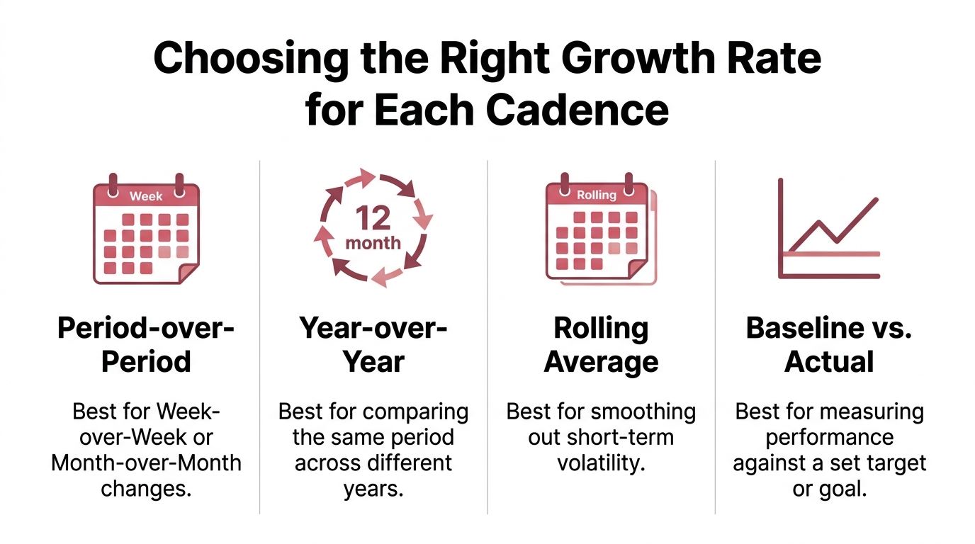
The reporting cadence should determine the growth rate, not the other way around. A weekly dashboard, a quarterly forecast meeting, and a board review answer different questions, so they shouldn't publish the same primary rate.
Match the method to the meeting
Period over period works for week over week or month over month dashboards. It shows the latest operating pulse and helps managers investigate a sudden change. It also reacts quickly to noise, especially when opportunities enter the pipeline in batches or a small number of deals changes the total.
Month over month is useful when the team wants a smoother view than weekly reporting while still tracking early traction. It can reveal a developing trend, but the team shouldn't treat every monthly movement as structural growth.
Quarter over quarter often fits B2B sales better than monthly reporting. Monthly contracts can be too noisy for a meaningful conclusion, while annual contracts can hide changes for too long. Quarterly reporting gives sales cycles more room to develop without removing operating visibility.
Year over year becomes the more honest comparison when seasonality affects demand. Comparing like months across different years accounts for recurring buying patterns that can make adjacent month comparisons look worse or better than the underlying business.
CAGR belongs in multi year strategic reviews, board decks, and comparisons spanning more than four quarters. It smooths the path, which makes it useful for direction but dangerous when leaders mistake the smoothed rate for the actual operating pattern.
Each rate has a failure mode
Year over year analysis can hide acceleration because a strong recent quarter may sit inside a broader annual comparison. Month over month growth can amplify noise. CAGR assumes a steady compounding path that almost never exists in a real GTM motion.
A practical publishing rule keeps the dashboard honest:
- Publish period over period for the weekly execution meeting.
- Publish month over month for a monthly operating review.
- Publish quarter over quarter when the sales cycle needs more time.
- Publish year over year when seasonality shapes demand.
- Publish CAGR for long range planning, not for diagnosing the latest pipeline movement.
Teams that also need better forecast discipline can pair these views with sales forecast accuracy practices. The rate tells leaders what changed. Forecast context helps explain what may happen next.
Excel and Google Sheets Templates That Hold Up
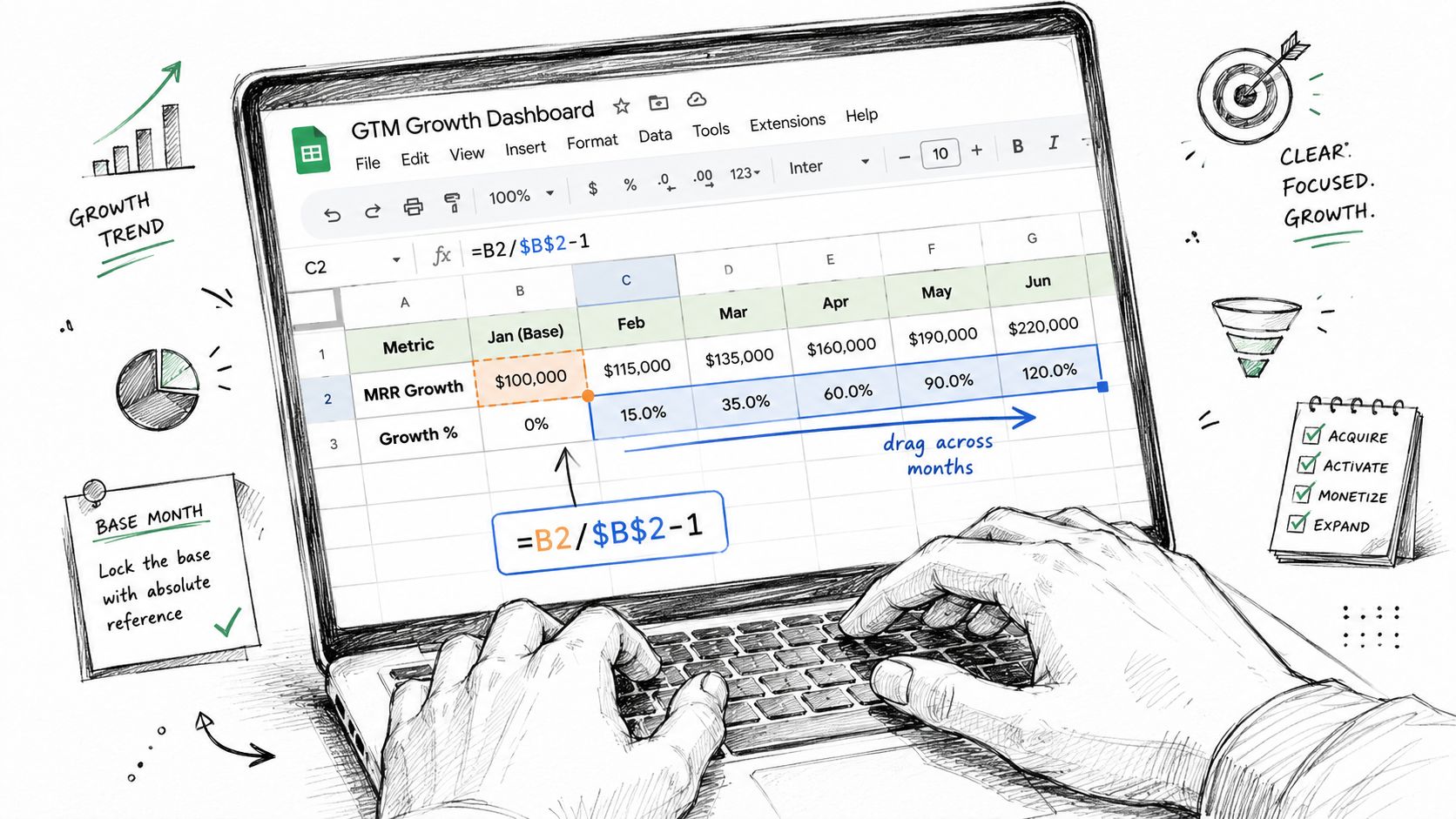
A useful spreadsheet makes the denominator visible and keeps it fixed when formulas move across columns. A fragile spreadsheet changes the reference as the analyst drags the formula, producing a polished but incorrect dashboard.
Start with a simple table:
| Month | Metric | MoM % | YoY % | CAGR Trailing 12 |
|---|---|---|---|---|
| Month value | Metric value | Formula | Formula | Formula |
Assume column A contains dates and column B contains the metric. For a basic month over month calculation, a formula can use the prior value as the denominator:
=B2/$B$2-1
The absolute reference keeps the starting value fixed when the formula is copied. For a more general year over year comparison, the sheet needs to locate the matching month from the prior year. An INDEX and MATCH pattern can do that:
=B2/INDEX($B:$B,MATCH(DATE(YEAR(B2)-1,MONTH(B2),1),$A:$A,0))-1
This structure searches column A for the equivalent month and returns the corresponding metric from column B. It keeps the lookup ranges fixed while allowing the current row to change.
Keep the CAGR logic readable
For a CAGR cell, use named ranges such as START, END, and YEARS:
=(END/START)^(1/YEARS)-1
Named ranges make the intent clearer for finance and RevOps users who didn't build the original workbook. The underlying spreadsheet principle is also documented in an Excel CAGR formula example, which uses an absolute starting cell reference such as $B$2 so the denominator doesn't shift when the formula is copied.
Excel and Google Sheets overlap heavily, but portability still matters. Excel users may reach for XLOOKUP, while INDEX and MATCH remain a safer shared pattern when the file must work across both tools or pass between RevOps and finance.
Before automating formulas, clean the source data. Duplicate months, inconsistent labels, blank values, and mixed date formats can create errors that no growth formula can repair. Teams evaluating AI tools for cleaning spreadsheet data should still review the output manually, especially when the workbook feeds finance or leadership reporting.
A portable template should include a metric definition tab, a source field, a close date, and a note for any restatement. For teams building a wider operating system, these sales pipeline templates for 2026 can provide additional structural ideas, but the growth sheet should remain minimal enough that every denominator is auditable.
Where Growth Rate Calculations Mislead
A clean percentage can still describe the wrong business. Four failure modes appear repeatedly in GTM reporting: seasonality, unstable bases, snapshot selection, and measurement changes.
Seasonality changes the meaning of adjacent periods
Raw month over month reporting can be noisy in SaaS. A December to January decline may reflect a recurring calendar pattern rather than a loss of demand. The same issue appears in pipeline creation, demo volume, renewals, and marketing sourced opportunities.
A trailing twelve month view can reduce that distortion. It won't identify every cause, but it prevents one calendar transition from dominating the story. Year over year comparisons also help because they compare like periods rather than adjacent periods with different buying conditions.
Small or negative bases break intuition
A near zero starting value can produce a very large percentage from a modest absolute change. Negative values create an even bigger problem because the sign can reverse the apparent meaning of growth. A recovery from a negative base isn't naturally explained by a conventional percentage.
In those cases, report the absolute change alongside the rate. The operator should also show the underlying values and label the comparison as a base effect rather than presenting the percentage as a standalone performance signal.
Snapshot choice can manufacture a trend
An atypical start or end date can skew the result. A pipeline snapshot taken immediately after a large deal is created won't compare cleanly with a snapshot taken before a batch of opportunities enters the CRM.
Use period close rules and preserve historical snapshots. If the source system restates old values, record the restatement rather than replacing the prior report.
Definitions can move while the business stays still
A pipeline stage rename, a new attribution rule, or a reclassification of net new logos can change the curve without changing customer behavior. The calculation remains correct against the revised dataset, but the comparison no longer represents the same object.
Audit the metric definition before trusting the metric movement.
Maintain a definition lock file that records the field, filter, owner, source system, close rule, and any changes. That document gives finance, sales, and marketing a shared basis for deciding whether a new growth rate reflects business expansion or a measurement shift.
Putting Growth Rate Calculation Into Your Reporting Loop
Growth rate calculation belongs in the reporting process before the number reaches a leadership deck. The team should make the calculation repeatable, then make the exceptions visible.
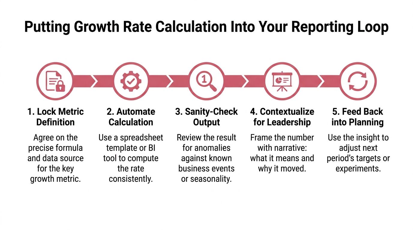
Use a five step control loop
Lock the metric definition. Write down the exact field, filters, source, period close rule, and denominator. If the definition changes, preserve the old version and label the break in the series.
Freeze inputs at close. Stop the weekly or monthly report from changing after the review. A frozen snapshot lets the team explain what it knew at the time rather than rewriting history whenever the CRM changes.
Pull from the source automatically. Use Google Sheets connected to the source system, a warehouse view, or a BI model. Manual copying creates opportunities for missing rows, changed filters, and accidental denominator shifts.
Show multiple views together. Place month over month or quarter over quarter beside year over year and CAGR where appropriate. A single period spike shouldn't dominate the conversation when a longer comparison tells a different story.
Flag weak bases and anomalies. Add a visible warning for unusually small, zero, negative, or recently redefined bases. The threshold should be agreed by the team and documented, not changed to make a result look better.
A sales dashboard examples guide can help teams choose a presentation format, but the dashboard should serve the control loop rather than replace it. Leaders need the rate, the base, the source, and the reason for movement in the same view.
Ship two small automations
A RevOps lead can use Google Apps Script to post the weekly growth table to Slack after the source sheet refreshes. The message should include the metric name, comparison window, current value, prior value, calculated rate, and anomaly status. That creates a consistent pre read without asking an analyst to paste figures into a channel.
A Looker or Mode tile can also trigger when year over year movement exceeds the team's agreed tolerance. The alert shouldn't declare success or failure. It should ask the owner to check seasonality, base effects, data completeness, and definition changes before the number enters the leadership narrative.
The best growth report doesn't just calculate a rate. It shows why the rate deserves belief.
The weekly meeting then becomes more productive. Operators spend less time arguing about spreadsheet mechanics and more time deciding whether the movement reflects demand, execution, timing, or measurement.
Yalc helps GTM teams connect source data, reporting, and execution through a unified operating layer, so growth metrics can be calculated and checked before they shape decisions. Visit Yalc to explore AI native GTM workflows, automated playbooks, and reporting that keeps the data, context, and operator review together.