7 Sales Rep Dashboard Examples for Pipeline Visibility

Most rep dashboards fail before the first standup because they're designed for a quarterly manager review, not for a seller deciding what to do next. Reps quickly stop trusting numbers that have no visible source, unclear refresh time, or obvious connection to a deal they can change today. A useful dashboard shows four to six actionable numbers, ties each one to a system of record, and gives the rep a first move when a tile turns red. That matters as CRM adoption shifts sales operations away from isolated spreadsheets and toward structured records for opportunities, activities, forecasts, and performance trends. A compiled review reports that 74% of surveyed sales and marketing professionals had purchased CRM software during the previous 12 months (CRM statistics review). The seven sales rep dashboard examples below cover CRM native views, multi source boards, TV broadcasts, and outreach analytics. Each example focuses on the KPI layout, data path, common failure points, and first action.
Table of Contents
- 1. Salesforce Sales Cloud
- 2. HubSpot Sales Hub
- 3. Pipedrive Insights
- 4. Databox
- 5. Geckoboard
- 6. Salesloft
- 7. Outreach
- Top 7 Sales Rep Dashboard Comparison
- Pick the Dashboard Your Reps Open Every Morning
1. Salesforce Sales Cloud
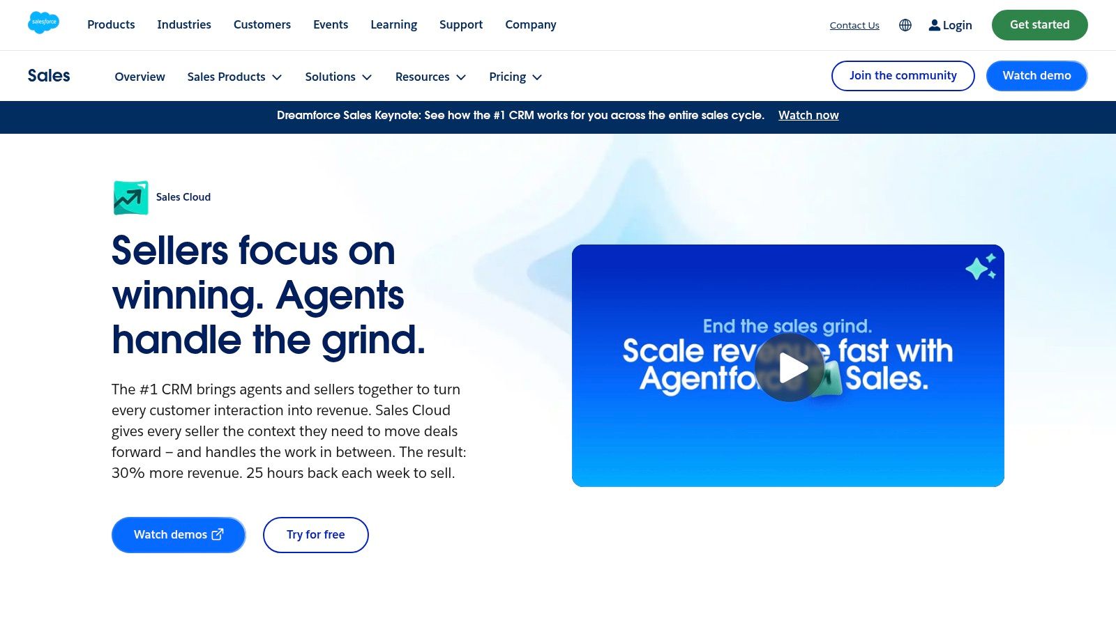
Salesforce works best when the CRM already contains the rep's opportunities, activities, quota, and forecast categories. Its native Lightning dashboards can provide secure, role based views, including dynamic dashboards filtered to “My Data,” without exporting records to a separate reporting tool. Teams can also use Sales Engagement sample dashboards for calls, emails, meetings, and engagement.
Dashboard layout and first action
A practical rep view starts with quota attainment, open pipeline, win rate, forecast value, and recent activity. The source is Salesforce opportunity, task, event, and quota data. The first action is simple: if quota attainment is behind pace while pipeline is healthy, the rep opens the oldest opportunities and confirms a dated next step. If pipeline is thin, the rep moves to new opportunity creation rather than logging more low value activity.
Salesforce's main advantage is governance. Admins can control folders, sharing, permissions, and row level access, while embedding dashboards on rep Home pages. Trailhead and Salesforce Help also provide recipes for building rep dashboards, and the platform publishes a Salesforce Sales Cloud gallery of salesperson dashboard examples.
The weak point is administration. Custom filters, unusual quota logic, and cross object reporting can require admin time. Dynamic dashboard limits also vary by edition, so a design that works in a pilot may need restructuring at scale.
Practical rule: A Salesforce dashboard should show the opportunity evidence behind a forecast, not only the forecast category. Reps need to see the contact, next step, stage age, and close date that justify the number.
Forecast reliability deserves its own view. Forecast variance can be calculated as predicted revenue minus actual closed revenue, then reviewed by rep and forecast snapshot. A rep dashboard that exposes this history supports a more useful approach to sales forecast accuracy than a static expected revenue tile.
For teams comparing Salesforce with other CRM automation options, the dashboard decision should sit alongside how to evaluate CRM automation tools. The best fit is the system reps already update consistently.
2. HubSpot Sales Hub
HubSpot is the fast setup option for teams that want reps to see email, call, meeting, deal, and sequence information in one CRM native workspace. Its prebuilt reports, templates, and drag and drop dashboards reduce the distance between creating a view and getting it into a rep's daily routine.
Dashboard layout and first action
The useful layout is pipeline by owner, meetings booked, sequence activity, deal conversion, and stale deals. HubSpot CRM records feed the first four tiles, while sequence and engagement records supply the outreach signals. The first move when a tile turns red is to filter owner to the current rep, inspect the underlying records, and either book the next meeting or update the deal stage.
The owner equals current rep filter is especially useful because it gives each seller a personal view without creating a separate dashboard for every user. Managers can retain a team view and compare activity, pipeline, and meetings booked by owner. That separation helps avoid a common failure mode, where reps see a manager's scoreboard but not the accounts requiring attention.
HubSpot's advantage is adoption. The interface is accessible to teams that don't have a dedicated analyst, and the platform's Sales Hub reporting resources provide templates and educational guidance for common dashboard use cases.
The trade off appears when the team needs advanced period math, complex custom calculations, or unusual cross object reporting. Some advanced reporting and builder features require higher tiers or paid plans. That isn't necessarily a reason to leave HubSpot, but it should be tested before the team promises a forecast model.
A useful operating pattern is to keep the rep page compact, then provide drill down reports for managers. Don't put every email count, call count, and sequence state on the first screen. Activity volume should explain what changed in the pipeline, not replace pipeline evidence.
3. Pipedrive Insights
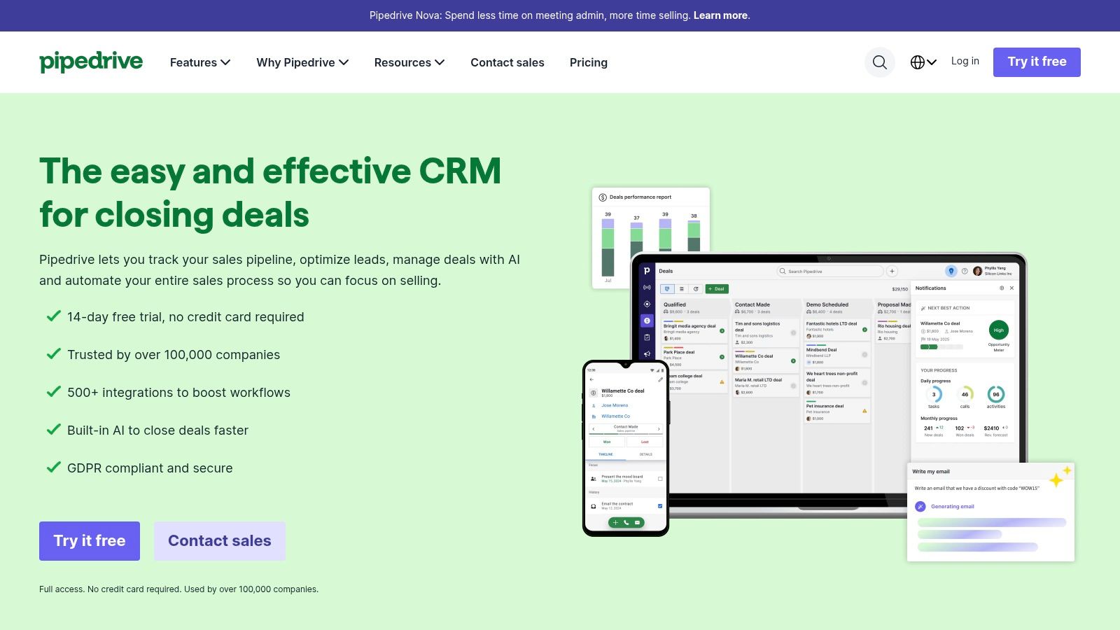
Pipedrive earns its place when reps need a clean view of deals, activities, goals, and leaderboards without an enterprise analytics project. Its Insights area is designed for quick adoption, so the dashboard can support a standup or one on one review without forcing sellers through a dense reporting interface.
Dashboard layout and first action
The strongest layout uses goal progress, deal progress, activity completion, pipeline by stage, and recent wins. Pipedrive deal and activity records feed the view, while goal settings provide target tracking. When a goal tile turns red, the rep checks the remaining target against the current selling period, then opens the pipeline view and prioritizes opportunities with a clear next step.
The platform includes shareable views and a template library for pipeline, activity, goal, and leaderboard dashboards. That makes it practical for small and medium teams that want a live operating view rather than a bespoke business intelligence layer. The clean interface also helps managers use the dashboard during reviews instead of exporting data to slides.
Pipedrive's limitation is analytical depth. Complex cross object questions, unusual attribution rules, and multi source analysis may require exports. A rep can understand which deals need attention, but a revenue operations team may need another system to explain how campaign source, product mix, margin, and territory interact.
A simple dashboard that a rep opens every morning is more useful than a flexible dashboard that requires a weekly explanation.
The Pipedrive website provides the product context, while the platform's own Insights templates are the practical starting point. Teams should define each metric before building the view. “Pipeline” should mean a stated opportunity population, not a manually selected collection of deals.
4. Databox
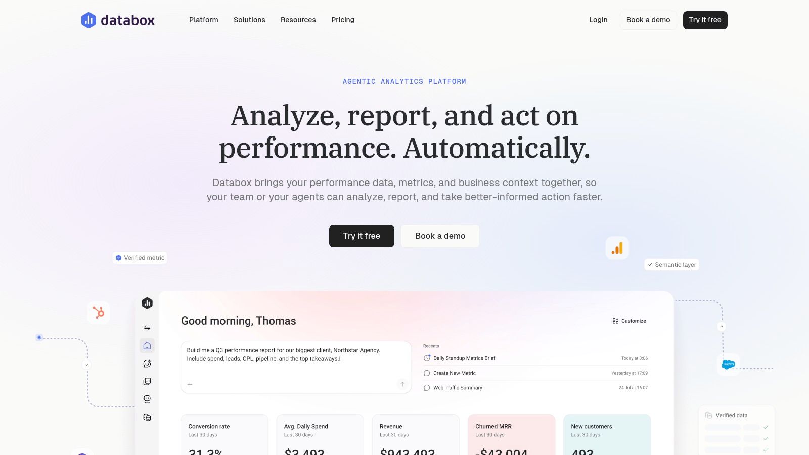
Databox is the better choice when the rep dashboard must combine CRM, outreach, marketing, and finance signals quickly. It aggregates data from connected tools and offers a template gallery with 300 plus templates, including sales performance and rep activity views. The platform's core value is speed across sources, not deep custom modeling.
Dashboard layout and first action
A useful board combines pipeline created, qualified opportunities, positive reply rate, meetings booked, and revenue attributed. CRM connectors supply pipeline and revenue, outreach tools supply replies and meetings, and campaign systems provide source or playbook filters. When a tile turns red, the rep checks whether the issue is execution or data delay before changing their behavior.
That diagnostic step matters because multi source dashboards often break at the joins. A campaign may use one account identifier, the CRM another, and the enrichment system a third. A meeting can then appear in outreach reporting but fail to attach to the opportunity that eventually closes. Databox makes the signals visible, but teams still need consistent naming, ownership, and attribution rules.
Databox supports mobile and TV sharing, scheduled snapshots, and alerts. Its Databox connections are useful for RevOps teams and agencies that need a non technical setup across HubSpot, Salesforce, and other sales tools.
The main trade off is data depth. Higher data limits may be needed for niche metrics or large source sets, and source or row limits vary by tier. Teams should test the exact filters, refresh behavior, and historical range with production data before treating the board as a forecasting system.
For teams deciding between reporting tools, the practical question is whether the dashboard needs to combine systems or expose the CRM. A broader sales reporting tools comparison helps frame that choice.
5. Geckoboard
Geckoboard is built for visibility on the sales floor. It suits teams that want live operational KPIs on a screen, in a shared link, or in Slack, rather than a deep analytical workspace where every manager drills through opportunity history.
Dashboard layout and first action
The board should show calls, meetings, pipeline, wins, and one quality measure such as stage conversion or positive replies. CRM and connected application data feed the tiles, while TV loops, alerts, and share links distribute the view. When a tile turns red, the rep takes the action attached to that metric, such as following up on overdue meetings or reviewing stalled opportunities.
The platform maintains a dedicated collection of sales rep dashboard examples and supports 80 plus native data sources and app integrations, including HubSpot, Google Sheets, and Shopify. Its low lift management makes it accessible to non technical operators, and the Geckoboard product is well suited to broadcasting a common operating picture.
The risk is public vanity. A screen full of calls and emails can create competition without showing whether buyers are progressing. Reps may optimize for logged activity, while managers mistake volume for commercial movement. The fix is to pair activity with an outcome tile and define the first action for each red state.
Visibility is useful only when the person seeing the number knows what to do next.
Geckoboard should handle the daily snapshot. CRM history or enterprise BI should handle forecast variance, stage cohort analysis, and attribution questions. That division keeps the broadcast board readable without pretending it can answer every management question.
6. Salesloft
Salesloft is strongest for SDR and AE teams that need to connect outreach behavior to pipeline movement. The dashboard can show what a rep did, how buyers responded, and whether those responses produced meetings or opportunity progress.
Dashboard layout and first action
A practical layout includes rep activity, call outcomes, meetings booked, pipeline movement, and stalled deals. Salesloft supplies engagement and call analytics, while CRM synchronization supplies opportunity and revenue context. If the call outcome tile turns red, the rep reviews outcomes by account and adjusts the next cadence task instead of increasing call volume.
Sales Performance dashboards, leaderboards, Cadence Home, and deal views support this activity to outcome workflow. Call analytics can expose patterns such as the best time to call and outcomes by rep, while native tasks and prompts turn findings into follow up. The product website is Salesloft.
The data path must be governed carefully. A rep can complete a cadence step without creating a meaningful CRM activity, or a CRM opportunity can advance without the associated outreach record. Sync rules, ownership mapping, and event definitions need regular review. Otherwise, the dashboard presents precise looking numbers that don't explain buyer progress.
Salesloft's trade off is flexibility and buying friction. Pricing isn't publicly itemized and typically requires a sales assisted purchase, while advanced dashboards may feel rigid for uncommon sales motions. Teams should test whether the default objects and workflows match their process before customizing around them.
The best use is a daily execution board with enough pipeline context to prevent blind activity. It shouldn't replace the CRM forecast view or a finance approved revenue report.
7. Outreach
Outreach fits outbound teams that want daily rep activity and outcome visibility in the same working environment. Its dashboards cover rep and team performance, sequence reporting, calls, meetings, and pipeline created, so managers can inspect whether a motion is generating buyer progress rather than only completed tasks.
Dashboard layout and first action
The rep view should use calls, emails, meetings booked, sequence engagement, and pipeline created. Outreach activity records feed the first four tiles, while CRM synchronization supplies opportunity creation and attributed revenue. When a tile turns red, the rep opens the underlying sequence or account list, checks the response and call outcomes, then changes the next action for the affected segment.
Customizable Performance and Team Activity layouts help separate the rep workspace from the manager view. Manager tiles can include leaderboards and call outcomes, while reps need a shorter list tied to the accounts they can act on. Outreach also provides guidance for bringing activity into Salesforce reporting, which matters when the CRM remains the forecast system.
The main caution is packaging. Pricing and packaging are evolving around AI and credits, so total cost should be verified with the vendor. Sales assisted purchasing also means the team may need a direct discussion to understand limits, included capabilities, and the cost of the intended reporting setup.
The tool is purpose built for outbound, but it still depends on disciplined definitions. “Meeting booked” should identify the account and owner. “Pipeline created” should specify the attribution window and opportunity stage. Without those rules, sequence reporting can make a campaign look productive while the CRM tells a different story.
Teams comparing Outreach with other outbound systems can review Outreach alternatives before committing to a reporting architecture.
Top 7 Sales Rep Dashboard Comparison
| Solution | 🔄 Implementation Complexity | ⚡ Setup & Resource Needs | ⭐📊 Expected Outcomes / Impact | 💡 Ideal Use Cases | Key Advantages |
|---|---|---|---|---|---|
| Salesforce Sales Cloud | 🔄 High, admin/configuration required | ⚡ Moderate–High, admin skills, licenses, governance | ⭐📊 Enterprise‑grade, secure rep‑level pipeline & quota visibility | 💡 Large orgs on Salesforce needing governed, role‑based reporting | Native Lightning dashboards, strong governance, embedded rep Home |
| HubSpot Sales Hub | 🔄 Low, no‑code drag‑and‑drop | ⚡ Low, fast setup, strong UX adoption | ⭐📊 Rapid adoption; consolidated CRM‑native reports and rep views | 💡 SMB to mid‑market consolidating GTM in one platform | Prebuilt templates, easy no‑code dashboard building |
| Pipedrive (Insights) | 🔄 Low, simple templates and UI | ⚡ Low, quick implementation, minimal resources | ⭐📊 Practical rep dashboards and real‑time target tracking | 💡 Small/medium teams prioritizing simplicity and speed | Fast setup, shareable views, clean UI for rep engagement |
| Databox | 🔄 Low, connector/template driven | ⚡ Low–Moderate, connectors; non‑technical setup | ⭐📊 Fast multi‑source consolidation (CRM + outreach + finance) | 💡 Teams needing cross‑system dashboards without heavy engineering | 300+ templates, one‑click connections, mobile/TV sharing |
| Geckoboard | 🔄 Low, focused on TV/live boards | ⚡ Very low, plug‑and‑play for operational KPIs | ⭐📊 High visibility for daily KPIs; good for motivation/transparency | 💡 Sales floors and ops wanting live KPI broadcasts (TV/Slack) | TV loops, simple management, curated KPI examples |
| Salesloft | 🔄 Moderate, integration + cadence setup | ⚡ Moderate, CRM sync and configuration | ⭐📊 Strong activity→outcome insights for outreach workflows | 💡 SDRs/AEs needing outreach analytics tied to pipeline | Calls analytics, native workflows, actionable cadence insights |
| Outreach | 🔄 Moderate, customizable layouts and seq. analytics | ⚡ Moderate, integration effort; evolving packaging | ⭐📊 Purpose‑built outbound performance and sequence metrics | 💡 Outbound SDR/AE teams running sequences and cadence programs | Sequence reporting, manager/rep views, guidance for CRM integration |
Pick the Dashboard Your Reps Open Every Morning
The right choice is usually the tool that already holds the activity and pipeline data your reps maintain. Start with three rep tiles and one daily action rule, then add complexity only when a real decision requires it. Every tile should identify its source system, refresh timing, owner, calculation, and red state. If nobody can explain where a number came from, it doesn't belong on the first screen.
Quota attainment should be calculated as closed revenue or units divided by the assigned quota. A representative who closes $75,000 against a $100,000 quarterly quota has 75 percent attainment, and the dashboard should show that beside remaining quota and selling days left (sales KPI formulas). Mixing monthly quotas with quarterly bookings creates a misleading view.
Pipeline coverage needs the same discipline. $300,000 in open pipeline against a $100,000 quota equals 3.0 times face value coverage, but weighted coverage should apply opportunity close probabilities separately (pipeline coverage guidance). Stage conversion also requires opportunity history. If 40 qualified opportunities enter discovery and 12 reach proposal, the discovery to proposal rate is 30 percent, but current stage counts alone can't show whether deals advanced, stalled, or moved backward (pipeline dashboard guidance).
Forecast tiles should preserve the snapshot date, forecast category, close date, and later outcome. A $200,000 forecast against $180,000 closed produces a $20,000 overforecast and 90 percent accuracy using the simple actual divided by forecast method (sales reporting guidance). That evidence makes the dashboard useful for coaching, not just inspection.
If signals sit across CRM, outreach, and enrichment tools, Yalc's CRM Syncer and Campaign Reporter can keep those records aligned before they reach the dashboard. A small pilot team can review the numbers every Friday, remove any tile nobody acted on, and expand only after the definitions hold. Teams that care about interface quality can also check out Stripe and Linear style dashboards.
Yalc connects CRM, enrichment, outreach, campaign execution, and reporting through a unified GTM API, with CRM Syncer and Campaign Reporter available for keeping dashboard signals aligned. Teams can run preconfigured playbooks from Slack or the Yalc UI, or compose their own workflows through the Yalc MCP, then review the audit trail and measured outcomes in one operating layer. Visit Yalc to build a rep dashboard that turns fragmented GTM activity into trusted next actions.